[1222] [Accessibility] Reinstate High Contrast Alerts
tracked
MisutaaAsriel
In 1222, the Quick Menu alerts (for settings like Earmuffs) were adjusted to a new UI style.
This new style is lower-visibility, and more difficult to discern outside of the icons displayed next to them. Whilst this is nice for some users, it presents a challenge for those who may be visually impaired or struggle to discern UI elements.
Whilst this was purportedly passed along to the design team already, I am opening a canny here to keep track of this.
Additionally
, to make said alerts easier on the eyes, recommendation is to tone down the color pallet of the alerts, whilst using a brighter color for the outlines. Button to disable settings is to be inverted for ease of access and visibility.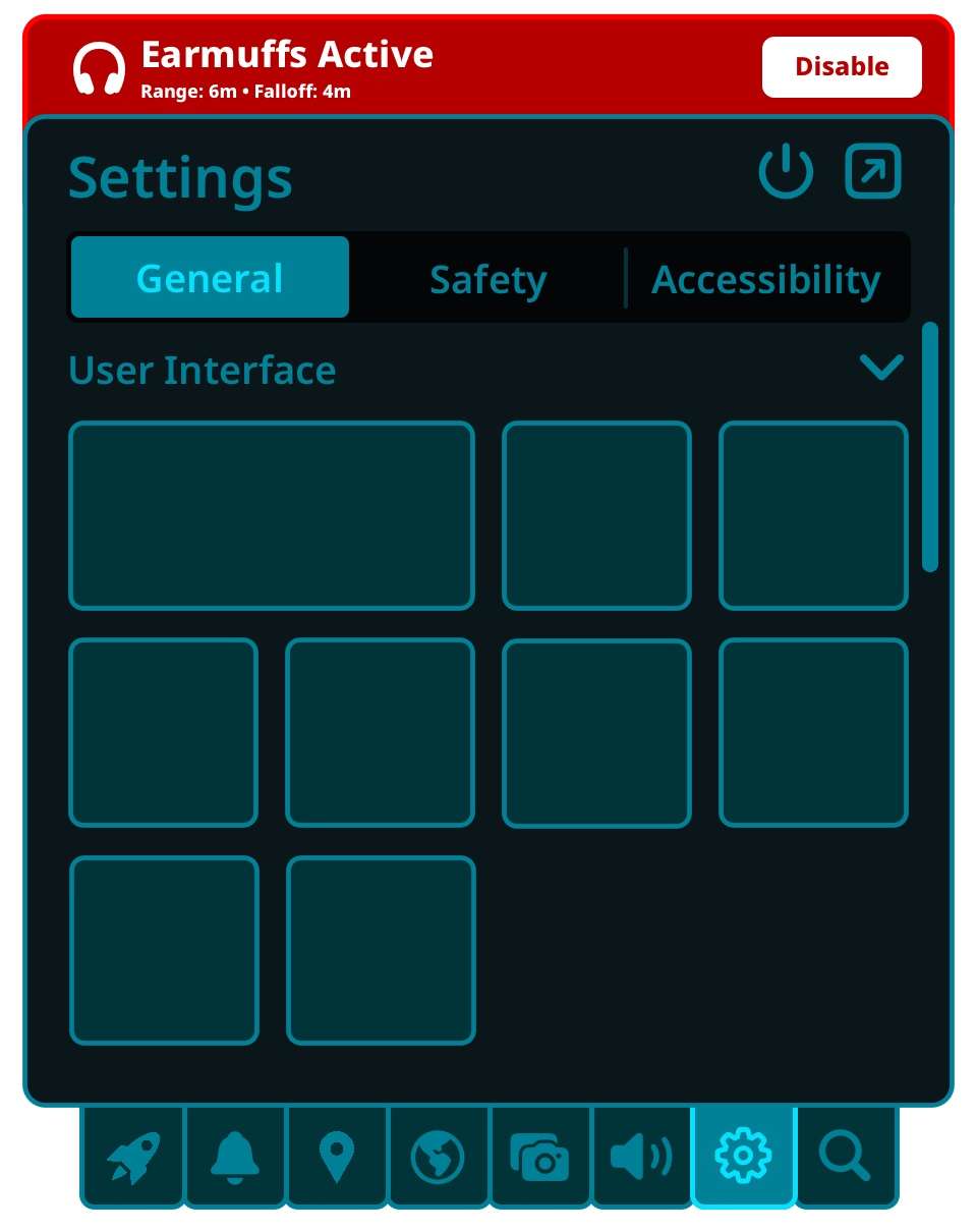
Log In

Scout - VRChat Head of Quality Assurance
marked this post as
tracked